
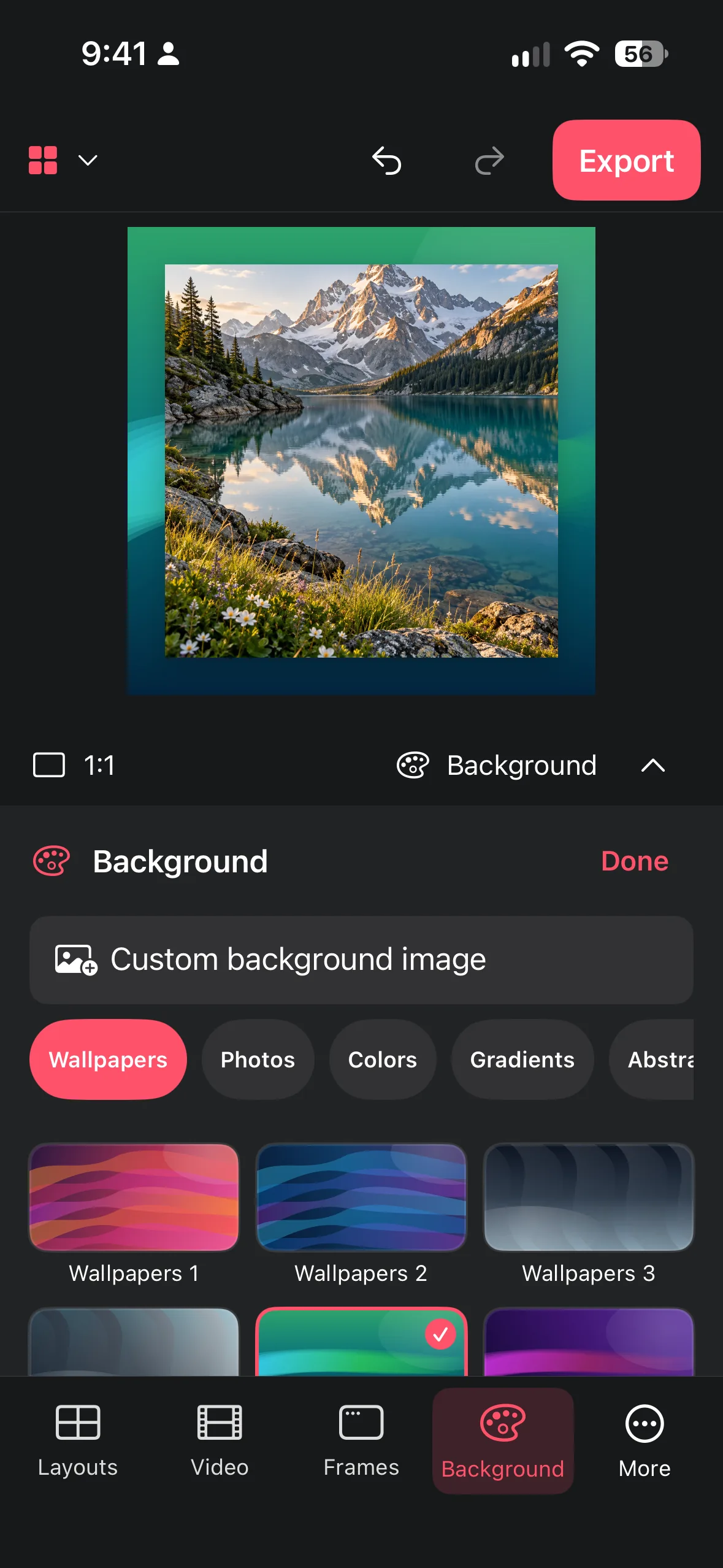
Choose patterns, nature scenes, or your own image without sacrificing contrast, focus, or readable edges.
Choose a background with a job
Start by naming the job: documentation, announcement, memory, portfolio, or mood board. A plain or softly colored background is often best for documentation. A nature image can add atmosphere to a personal story. A pattern can make a playful collection feel intentional, provided its scale is quiet enough behind the photos.
Use a supplied background when you need speed and consistency, or add your own image when the place and story matter. Crop the background to the canvas before judging it. A detail that looks subtle in a thumbnail can become a bright distraction behind a small tile.
- Name the communication goal.
- Try a calm color, then a restrained pattern or nature scene.
- Compare the background behind the actual collage, not by itself.
Protect readability and edges
Check contrast around every tile, especially pale photographs and white frames. If a light image disappears into the background, choose a darker or more even area behind it. If a dark photo merges into a dark scene, move the collage or switch backgrounds before adding decoration.
Patterns need special care. Large, low-contrast shapes can create rhythm; tiny high-contrast details compete with faces and text inside the photos. Keep important content away from the busiest region, and preserve a visible outer edge so the collage does not look cut out by accident.
- Inspect the lightest and darkest photo against the background.
- Move busy details away from faces and important text.
- Check that the outer edge remains visible on all sides.
Work with a custom image
An own image can carry useful context: a desk, a wall, a landscape, or a color texture you made yourself. Choose a source with room for the collage and no essential subject in the placement area. If the image contains a person or recognizable place, make sure you have the right to share it.
Look at the background crop after the collage is placed. The subject of the background may need to move to a corner or disappear behind the layout. That is not a defect; the background supports the foreground. Keep a clean source copy so you can try a different crop without quality loss.
- Select an own image with quiet placement space.
- Position the collage where the background detail is least competitive.
- Review the complete composition and retain the source for revisions.
Use a final legibility checklist
View the finished design at the scale where it will be shared. Check the title or key text inside the photos, face visibility, white frame separation, and the contrast of every corner. Then look away and back: the intended focal point should return first.
If the design fails, change one variable at a time. Test a simpler background, move the collage, alter the gap, or reduce pattern contrast. Avoid changing all four at once because you will not know which decision helped. Current paid background conditions and available tools are defined by the current in-app UI and store information.
- Check text, faces, frames, and corners at sharing size.
- Change one background variable and compare again.
- Save only after the focal point and edges remain clear.
Frequently asked questions
When should I use a pattern?
Use one when it reinforces the mood and stays low contrast. If it competes with faces, text, or edges, simplify it.
Can I use my own background image?
Yes, when the current app flow offers it. Choose an image with quiet space and share it only when you have the necessary rights.
Why does my collage look pasted on?
Check edge contrast, spacing, and placement. A calmer background and an intentional margin usually create better separation than extra effects.
Make a collage from your photos
Explore Collage Easy for iPhone, iPad and Macs with Apple silicon.
